

Trade show exhibit graphics are not decoration. They are one of the most powerful tools in the exhibit design arsenal. Used well, they stop people in the aisle, tell them who you are, and make your booth easier to understand in seconds.
Color and graphics shape first impressions, control what attendees notice first, and help your brand stand out on a crowded show floor without turning the booth into visual noise. They are also where most exhibit design mistakes are made, either by overloading surfaces with information or by underusing the visual real estate that gets the most aisle exposure.
First Impressions Happen Fast
Trade show attendees are not studying your booth like a brochure. They are walking past it while scanning dozens of other exhibits, signs, screens, lights, and people.
Your design has a tiny window to make sense.
Strong color, bold graphics, and clean hierarchy help answer the only questions that matter at first glance:
- Who is this brand?
- What do they do?
- Why should I care?
- Where should I look first?
If your booth makes people work too hard to understand, they move on. That is not harsh. That is the show floor. This is one of the most direct ways that brand strategy shapes trade show exhibit design, where the messaging hierarchy established before design begins determines which graphics earn the most visible real estate.
Color Creates Aisle Visibility in Trade Show Exhibit Graphics
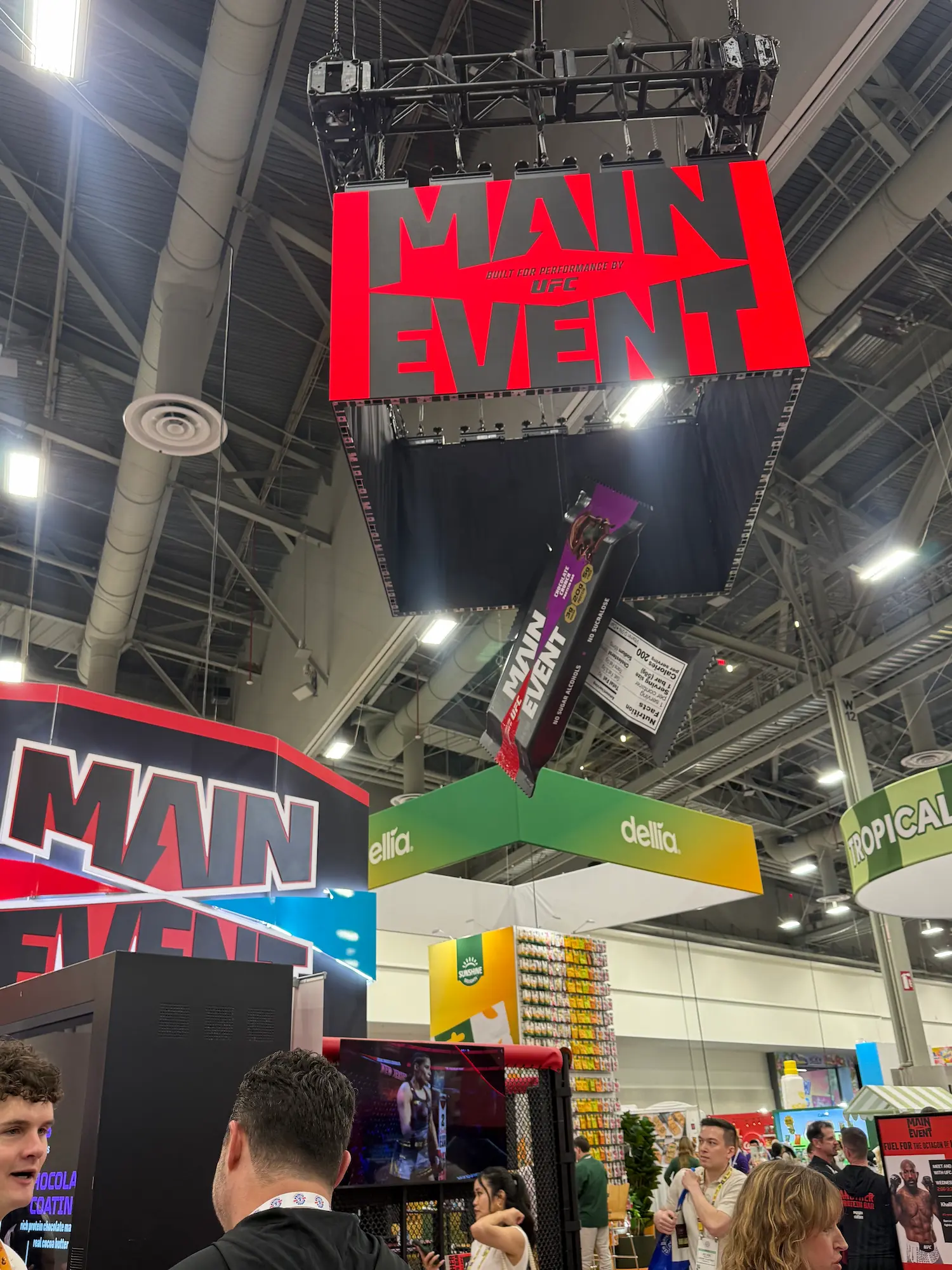
Color is one of the fastest ways to get noticed from a distance. High-contrast color choices can make your exhibit easier to spot across the aisle, while muddy palettes or low-contrast graphics disappear under convention hall lighting.
That does not mean every booth needs to be loud. It means your color strategy needs to be intentional. A clean black-and-white booth can dominate if the contrast is sharp. A bright booth can fail if every surface is fighting for attention.
The best exhibit color choices support the brand while making the booth readable from multiple angles and distances. This is especially important when the booth sits next to competitors with similar products or services, where color and contrast become the fastest way to signal that your brand is different before anyone reads a word. According to CEIR, color and visual contrast are among the top factors influencing whether an attendee stops at a booth, with high-contrast graphics at eye level consistently outperforming text-heavy or low-contrast designs in aisle traffic studies.
Trade Show Exhibit Graphics Should Guide, Not Overload
Graphics are there to communicate fast. They are not there to carry every product feature, slogan, award, and paragraph your team could not fit on the website.
Big graphics should do the heavy lifting:
- Brand name or logo
- Core message
- Product or service category
- Key visual or hero image
- Directional cues, when needed
Your main exhibit graphics should pull people in, not force them to read a wall. This connects directly to trade show booth traffic flow, where graphics that are too dense or too dispersed create the same problem as a poorly planned layout: attendees do not know where to go or what to do next.
Visual Hierarchy Tells People Where to Look
Visual hierarchy is the order in which people notice things. Without it, everything competes. When everything competes, nothing wins.
A strong trade show exhibit design usually has one primary focal point, a few supporting elements, and clear secondary details. Your logo, headline, product display, screen, and demo area should not all scream at the same volume.
That next step might be entering the booth, watching a demo, scanning a QR code, or talking to your team. When visual hierarchy is clear, the booth guides behavior without anyone having to explain it. When it is missing, staff spend the whole show pointing people toward things that should have been obvious from twenty feet away.
Brand Consistency Still Matters
Standing out does not mean abandoning your brand. Your booth should feel like a physical extension of your company, not a random theme slapped onto a structure.
Use brand colors, fonts, image style, tone, and messaging consistently across the exhibit. That includes overhead signage, wall graphics, counters, screens, flooring, printed materials, and staff touchpoints.
When everything feels connected, the booth looks more premium. When it does not, people feel the disconnect even if they cannot explain it. The same material and finish decisions covered in trade show booth materials affect how well the graphics integrate with the physical structure, since a strong graphic on a weak substrate rarely lands the way the design intended.
Trade Show Exhibit Graphics Checklist
Before approving color and graphics, run through this checklist. For a more comprehensive planning tool that covers graphics alongside layout, lighting, fabrication, and logistics, download the Highway 85 Trade Show Exhibit Design Checklist.
- Can attendees identify the brand from the aisle?
- Is the main message readable in a few seconds?
- Does the color palette stand out under show-floor lighting?
- Are the most important graphics placed at eye level or above?
- Is there one clear focal point?
- Are secondary messages supporting the main idea instead of competing with it?
- Do graphics stay consistent with the brand?
- Is small text limited to areas where people will actually stop and read?
- Do screens, printed graphics, and structural elements feel connected?
- Does the booth still make sense from multiple walking directions?
The Bottom Line
Trade show exhibit graphics, color, and visual hierarchy decide whether your booth gets noticed or ignored. A smart exhibit design uses them to create instant clarity, stronger aisle presence, and a more memorable brand experience. Do not cover the booth in more stuff. Make the right stuff impossible to miss. If you want a fabrication partner who thinks about graphics as part of the exhibit strategy from day one, explore Highway 85’s trade show capabilities or connect with our team to start planning.