


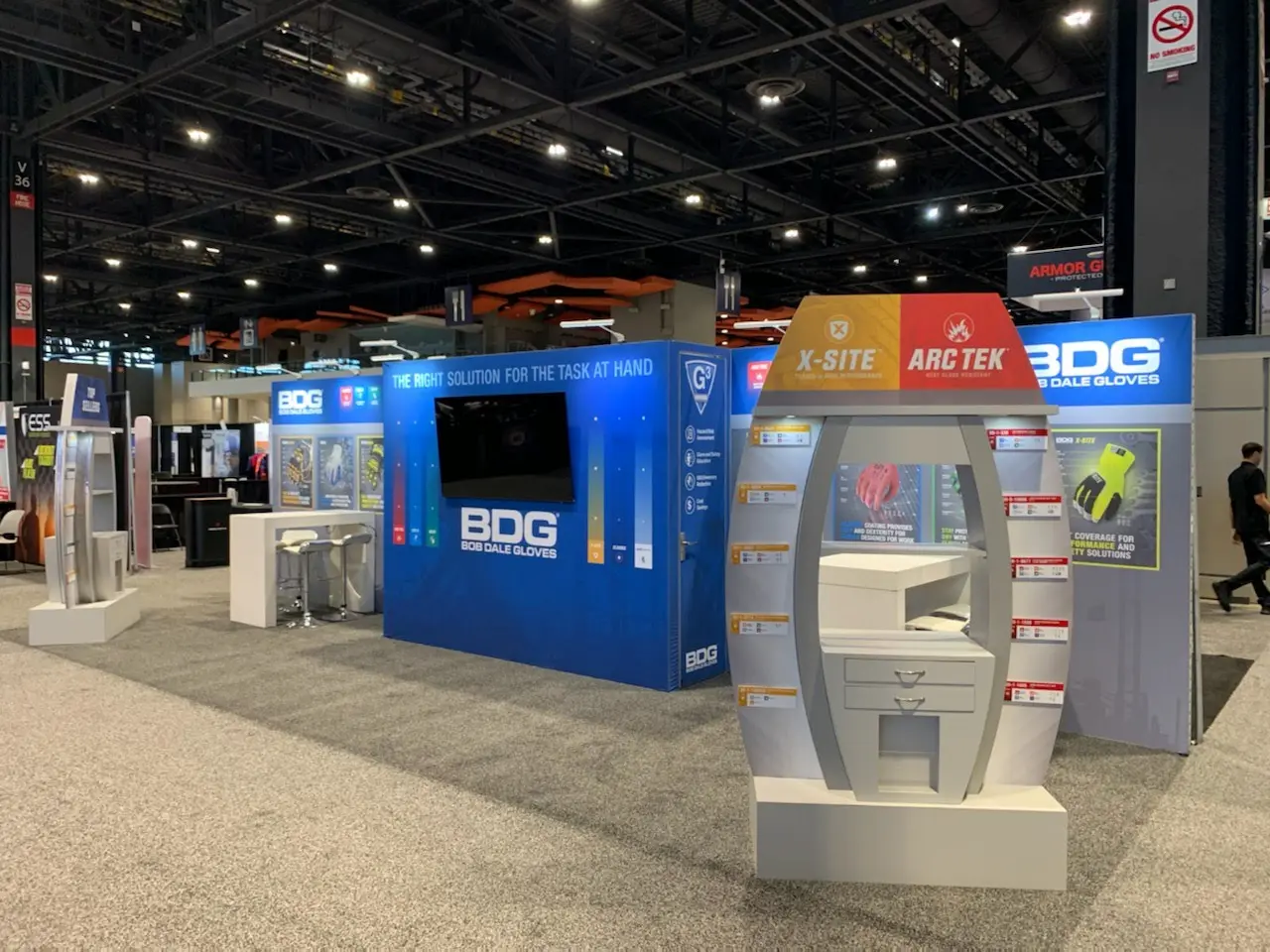
Small booth does not mean small impact. A 10×10 or 10×20 trade show booth design can still pull traffic, start strong conversations, and make your brand look sharp on the floor. But you do not have room to fake it. Every inch has to earn its keep.
The key is keeping the layout clean, the message tight, and the experience focused. Small booths fail when they try to do too much. They win when they make the right move fast. The same principles that define what makes a trade show exhibit design memorable apply here with less margin for error, because in a smaller footprint there is nowhere to hide weak decisions.
Start With One Clear Goal for Your 10×10 or 10×20 Trade Show Booth Design
Before you design anything, decide what the booth needs to do.
Are you trying to collect leads, demo a product, book meetings, launch something new, or simply get noticed in a crowded aisle? A small booth cannot support ten priorities at once. Pick the main objective, then build the layout around that.
For a 10×10 booth, that goal needs to be brutally clear. You may only have space for one strong engagement point. For a 10×20, you have more flexibility, but not enough to get messy. The same goal-first discipline covered in how to write a trade show exhibit design brief matters most at small scale, where a vague brief produces a booth that tries to do too much and succeeds at nothing.
Design for Open Access
Small booths should feel easy to enter. Do not block the front with a massive counter, bulky furniture, or walls that turn your space into a bunker. If people have to squeeze in, they probably will not.
For a 10×10, consider an open front with a backwall, one counter, and one focused display or demo zone. For a 10×20, you can create two light zones, such as a demo area on one side and a quick conversation space on the other.
The goal is to reduce friction and make it obvious where people should go. The trade show booth traffic flow principles that apply to large exhibits apply even more directly in a small footprint, where a single misplaced counter can turn a welcoming space into one people walk around instead of into.
Keep Your Message Short and Savage
A small booth has seconds to explain itself. Your graphics need to do the heavy lifting fast.
Strong small booth messaging should answer:
- What do you do?
- Who is it for?
- Why should someone stop?
- What should they do next?
Big headline. Clear value. Simple call to action. That is the game. The visual hierarchy principles covered in trade show exhibit graphics are the most practical tool for making this work, since a small booth has even less real estate to establish the messaging hierarchy before an attendee has already walked past.
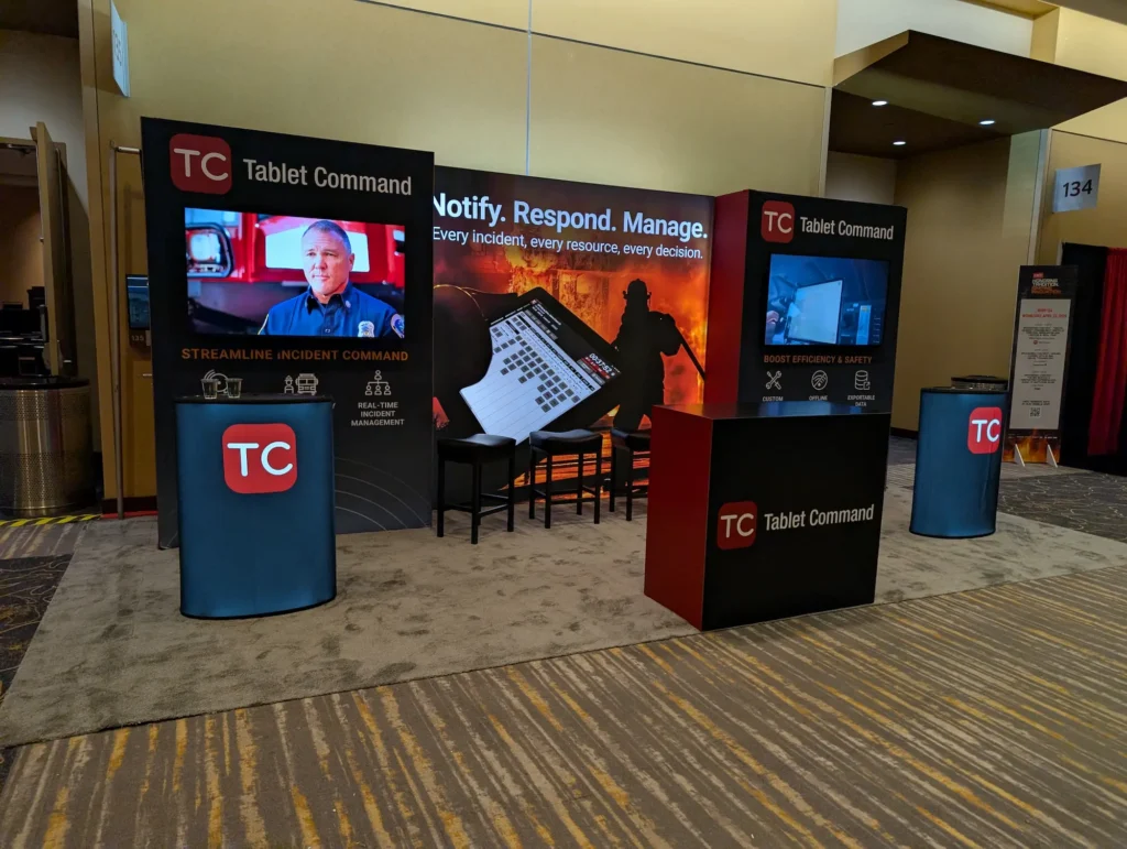
Tablet Command keeps its main message concise and prominent, while repeated branding and large-format graphics make the booth readable from across the aisle.
Make Storage Part of the 10×10 and 10×20 Trade Show Booth Design
Nothing wrecks a small booth faster than clutter. Bags, boxes, giveaways, cables, brochures, and staff items can turn a clean exhibit into a closet with a logo on it.
Build storage into the booth from the start. Use counters, cabinets, closet-style backwalls, or hidden compartments wherever possible. For 10×10 booths, storage is non-negotiable. For 10×20 booths, it can help separate staff space from visitor space without eating the entire footprint.
A clean booth looks intentional. A messy booth looks unprepared.
Use Height, Lighting, and Contrast
When floor space is limited, think vertical. A strong backwall, tall graphics, bold lighting, and clean contrast can make a small footprint feel bigger and more premium.
You do not need to scream. You need to be visible. Use height to pull eyes from the aisle, lighting to highlight your product or message, and contrast to separate your brand from the noise around you.
Small does not have to look cheap. Cheap looks cheap. The right combination of trade show exhibit lighting and material choices can make a 10×10 or 10×20 booth command its space rather than apologize for its size.
Plan the Staff Setup
Small booths get crowded fast. Too many staff members can make the space feel closed off before a visitor even approaches.
For a 10×10 booth, two staffers are often plenty. For a 10×20, you may be able to support three or four depending on the layout. Give your team a clear place to stand, greet, demo, and capture leads.
Do not let staff form a wall at the front of the booth. That kills traffic. The Experiential Designers and Producers Association recommends a maximum of one staff member per fifty square feet of booth space as a starting benchmark, noting that overcrowded booths consistently report lower attendee engagement scores than those with intentional staff positioning.
Quick Checklist for 10×10 and 10×20 Booth Design
Before approving your small booth design, ask:
- Is the main goal obvious?
- Can people enter without awkwardness?
- Is the message readable from the aisle?
- Is there built-in storage?
- Does the layout support staff movement?
- Is lead capture easy?
- Are graphics bold enough to compete?
- Does every element have a real purpose?
For a more comprehensive planning tool that covers small booth design alongside messaging, fabrication, and logistics, download the Highway 85 Trade Show Exhibit Design Checklist.
FAQ: Small Trade Show Booth Design
What should be included in a 10×10 trade show booth?
A strong 10×10 booth usually includes a branded backwall, clear messaging, one counter or demo point, hidden storage, lighting, and a simple lead capture setup. Keep it lean. No dead weight.
How do you make a 10×20 booth stand out?
Use the extra width to create zones. One side can handle demos or product displays while the other supports quick conversations or lead capture. Keep the front open and use bold graphics to anchor the space.
Should a small booth have seating?
Only if it supports the goal. Seating can help with deeper conversations, but it can also eat valuable space. In many 10×10 booths, standing-height counters work better.
Bottom Line
A 10×10 or 10×20 trade show booth design has to be disciplined. No clutter, no weak messaging, no oversized furniture pretending to be strategy. Make the booth easy to enter, easy to understand, and easy for your team to work. Small booths can hit hard, but only when every square foot is doing its job. If you want a fabrication partner who treats small footprints with the same strategic rigor as large island exhibits, explore Highway 85’s trade show capabilities or connect with our team to start planning.